I've always had a love of flags, which is odd as I strongly dislike both art and nationalism (arguably the two main things going on in a flag). I suppose that I'm drawn to the power of symbolism, and people's attempt to find meaning and identity through those symbols.
I recently saw Roman Mars' excellent TED talk about good and bad flag design. In the talk, Mars lists five key design elements for a successful flag:
1. Keep it Simple
2. Use Meaningful Symbolism
3. Use 2-3 basic colours
4. No Lettering or Seals
5. Be Distinctive (or be related)
The video prompted me to run up a quick and massively subjective list of the best and worst flags in the world.

Best
Vietnam
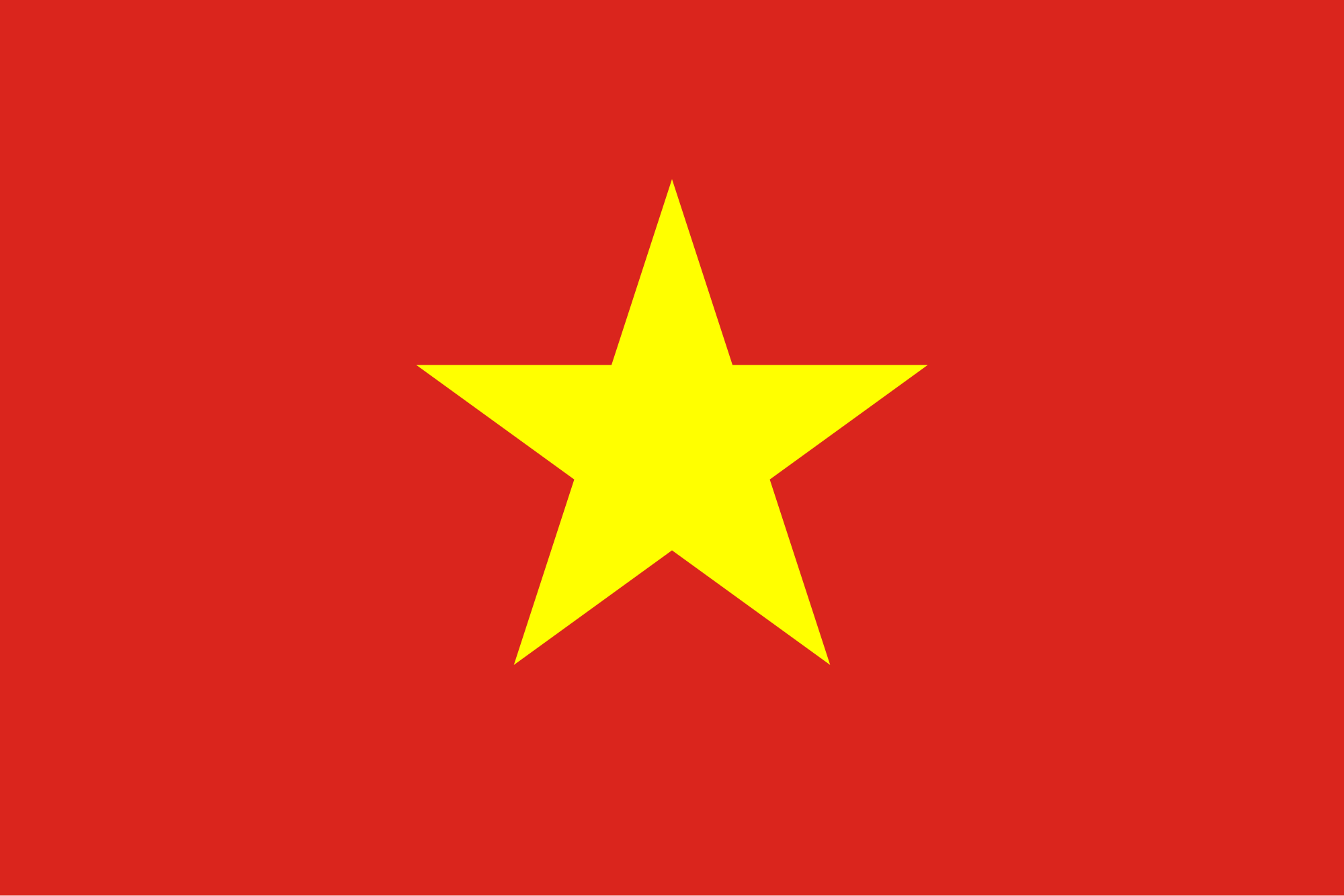
This is probably my favourite flag in the world. It's clean, bold, and effective. It hits all of the points listed above; it's simple, contains symbolism (the five-pointed communist star), has only two colours, contains no lettering or seals, and is distinctive. You've got two primary colours used in stark contrast with one another, yet they do not clash. Vietnam, you win at flags.
Ukraine

As I was thinking about symbolism in flags, I imagined what a flag could symbolise most literally about a country. "Well, the top would be blue to symbolise the sky and nature, and...wait a minute, that's the Ukrainian flag. And I bet the yellow symbolises their wheat!". I realise this is a rather pathetic thing to get excited about realising, but it does demonstrate the intuitive design of the Ukranian flag. Again, it's only two primary colours, and could be easily drawn by a child in 30 seconds.
California

Here's where my personal biases start to come in. The Five Flag Commandments specify that there should be no text, but I love the text on the state flag of California. The font is clear and striking, and has a timeless robustness to it. This is text done right, compared with the awful, utilitarian font in the San Francisco city flag. What else do I like about this flag? Somehow, "California Republic" has a better ring to it than "The Former Republic of California"- it's bold. The bear stikes the right balance between complexity and simplicty: it is detailed and shaded, yet easily recognisable in profile. It's also looking West- symbolism ahoy! The red band at the bottom is strong yet doesn't overpower the overall image.
Mozambique

I'll be honest, I put Mozambique's flag here because it has an AK-47 on it. I found out that little bit of trivia a few years ago, and have been over-sharing it with people ever since. As a whole, the flag isn't pretty, but a gun and hoe crossed over a book is undeniably strong imagery. A little too strong? Sure. But you don't forget about a flag with an assault rifle on it.
Nepal

Worst
Ecuador
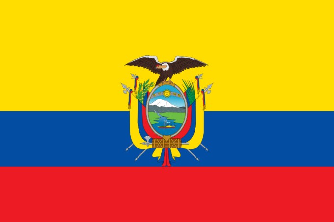
Look at this flag. Does something just seem off about it? Whenever I look at Ecuador's flag it imbues me with a profound sense of unease. I'm getting shivers down the spine right now just writing about it. Let me lay it out straight- the proportions are wrong. For me, any tricolour flag should be evenly spaced- why is the yellow bar larger than the blue and red bars?
The flags of Colombia and Rwanada also commit this sin, but they're avoiding the igmony of my shit-list as they don't also have a huge distracting seal in the middle which accentuates the asymmetry.
United Kingdom
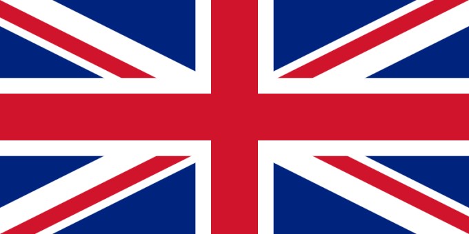
This leads to the complexity. Turns out that when you put three flags on top of each other, it gets a little busy. By my quick and unscientific estimation, there are 17 separate blocks of colour. Compare this with the beautiful simplicity of the Vietnamese or Ukrainian flags, and then look back upon the Union Jack with despair.
Finally my biggest bugbear: it's needlessly asymmetrical. Why is Northern Ireland's flag warped like that? It could go perfectly in the middle of the Scottish saltire, yet it's at weirdly incongruent tangents. One can only suppose this was done so that indignant Daily Telegraph readers could write a letter to the editor bemoaning the fact that some poor jobsworth somewhere has accidentally hung the damn thing upside down.
Australia

Manages to incorporate the aforementioned awfulness of the UK flag in the corner, whilst also having an easily forgotten constellation taking up 75% of the available space. Some of the stars have five points, others seven. Why? Ironically, the stars appear to form a question mark. It's as though the flag itself is questioning why it looks that way.
Additionally, it's almost exactly the same as New Zealand's flag- though credit to the Kiwis, they're at least doing something about the situation.
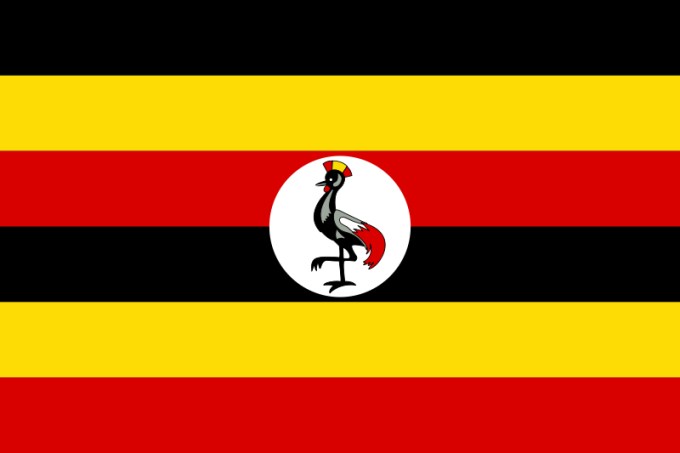
It's almost like they saw the German flag, reversed some of the bars, and thought "It's good...but let's double it". I've read that the bird in the middle is supposed to be a grey crowned crane, but honestly it looks more like a fighting chicken in faux-Roman armour. If you look at it for more than five seconds it begins to hurt your eyes (which should be regarded as a fundamental flaw in a flag) and has the unshakable feel of an optical illusion.
Some very good points so let me add some too.
ReplyDeleteCalifornia Republic, because you are never going to have a Democrat lead that lively lot.
Union flag only becomes a Union Jack when placed on the jack mast and if placed upside down signals distress on board. Wales is a Principality so it can't be counted, not that the English have ever counted it that much anyway. I suppose the flag could have been beef up with the red hand of Ulster chucked in but then would have committed one of the aforementioned deadly sins. If you look at the Basque flags you will notice a copy of the Union flag but with different colours, the Catalans have another variation.
Australia. The Southern cross as they would have to bend their necks a long way round the world to see the North star. The seven points of the stars represent the 7 states of Australia. This was explained to me by a very large gentleman one afternoon in a very run down pub in the middle of a very deserted Queensland township. He got me to repeat his offering of wisdom several times to ensure it had entered my skull.
Uganda adopted this flag after Independence from the UK in 1962, previous versions had the Crane and the Union flag combined for added nightmares.
Virgin Islands has an eagle, thunderbolts, Captain America logo and letters, it is ugly.
Japan, the simplest design going.
Completely agree- the Japan flag is wonderful and the Virgin Islands is atrocious. Up your game, Virgin Islands!
DeleteThere's a great little article as a follow-up to the Roman Mars video: "7 fantastic flags that break every design rule"
ReplyDeletehttp://ideas.ted.com/7-fantastic-flags-that-break-every-design-rule/