In this author's humble opinion, football badges are an underappreciated art. Much in the same sense that flags are a unique opportunity to symbolically represent a country, so too are club badges. To see how much these little bits of colourful fabric matter, just look at how worked up some fans get when clubs propose changing their badges (admittedly, those two examples are both from Liverpudlian clubs, so perhaps it's just the usual Scouse histrionics).
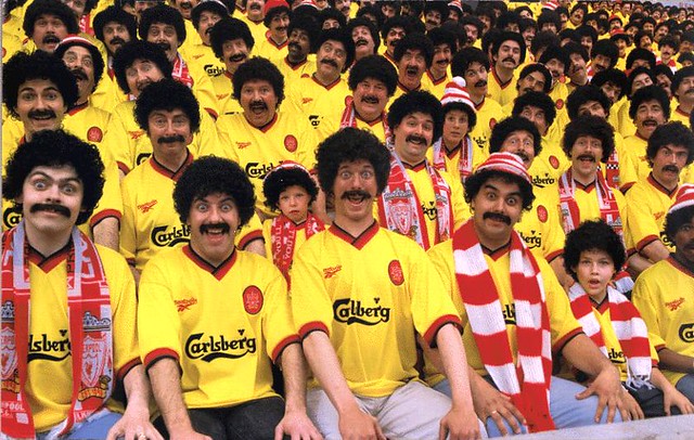 |
| Bastions of enlightened, well-reasoned thought |
Whilst the basic tenets of flag design might be fairly easy (simple, distinctive, limited colour palette), is far more tricky. What colours should it include? Any symbols of your club or area? Should it be intricate, or minimalist? Should it include the name of your team, or does that look too desperate? Club motto (preferably in Latin to make you look more sophisticated than you really are)? There's no secret recipe for badge design, but you sure as hell know a particularly good/bad badge when you see it.
With these considerations in mind, here's a review of some of the best, worst, and weirdest badges in world football:
The Good
Let's start close to home, in England. Being as fair and objective as I am, I'm going to look at my own team first.
Manchester United
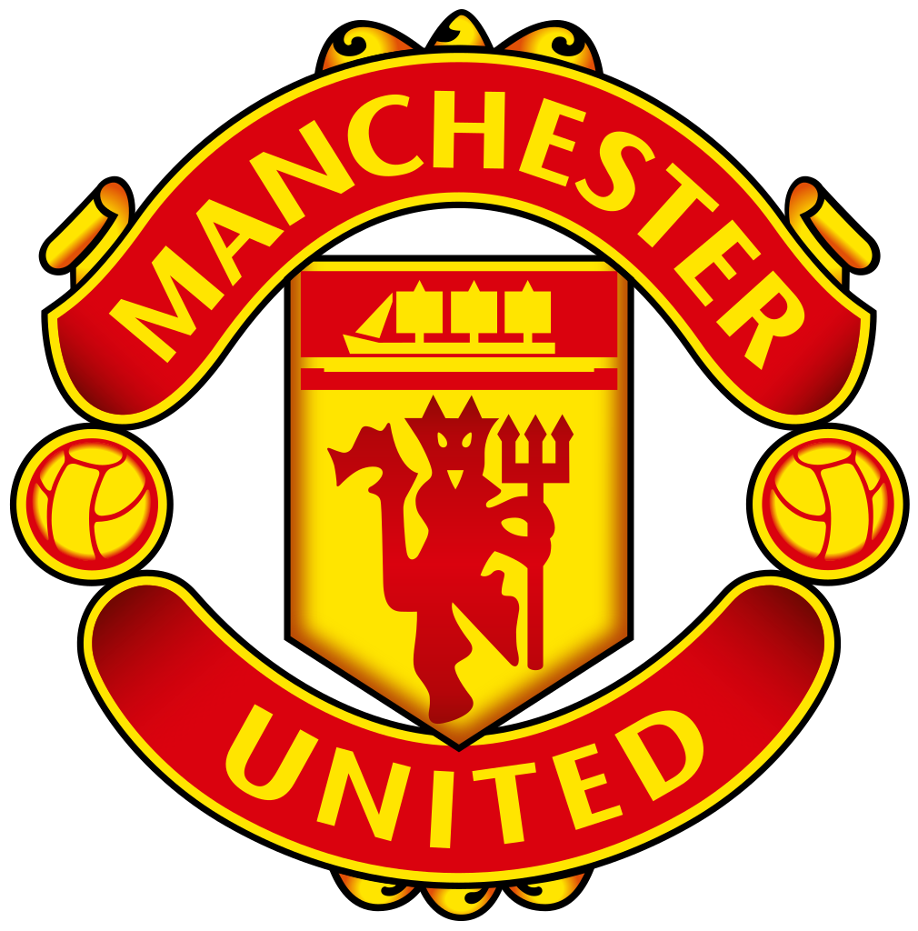
It's got a simple colour scheme, a symbolic nod to Manchester's shipping industry (and the club mascot), and just enough scrolling to add detail without being too tacky. Combine that with a simple and clear font, and you've got a winner.
Much as it pains me to say it, however, rival clubs have done sterling work on their redesigns in recent years. First, let's look at...
Chelsea
Compare it with the new design. The lion is central to the picture, much clearer, and holy crap, is it breathing fire? I don't know, but it looks good- even if it is carrying a curtain rod with a polo stuck on the end. The font is clear and crisp, and like the Man United badge it has just enough flourishes without being too gaudy.
Manchester City
 |
| Presumably how those on the continent reacted upon reading the City press release |
 |
| What happens when the objective and subjective sides of my brain collide |
Whilst the branding opportunities of the Premier League might have led to some of the best designs, a number of other clubs around the world have got it spot on:
The Bad
A number of factors can spell death for a football badge: they can be too fussy, too bland, too garish... or just a bit shit.
However, by far the most heinous crime to befall football badges would be what I term "Shitty Late 90's Video Game Icons"- the ones that look like they were randomly generated by a particularly soulless computer, replete with an unnecessarily corporate, polished look.
Saudi Arabia National Team
Milton Keynes Dons
"FUCKING BRILLIANT"
Olymiakos

Only two colours, unmistakably Greek, a brooding/pissed-off looking Spartan(?) Badge win.
New England Revolution
 Despite a godawful team name, this logo is on-point. 'Murica iconography? A
 football soccer ball in the corner so everyone knows what your team's about? Nice artistic twist? Check, check, and check.
New England Revolution
Zenit St. Petersburg

I've saved the best for last. Zenit's delightfully simple, baseball pennant inspired badge is a thing of beauty. Hands down my favourite badge in the wide world of football.
The Bad
A number of factors can spell death for a football badge: they can be too fussy, too bland, too garish... or just a bit shit.
| *COUGH* old Columbus Crew logo *COUGH* |
Saudi Arabia National Team
| Ugh. Looks like a logo from PES before they could afford real rights. |
China National Team
 |
| Ooph. This should belong to a shitty Counter Strike team. |
 |
| Actually, this one perfectly suits the ethos of the club. |
The Weird
There is, of course, a beloved third category: the wonderfully insane. These badges don't have much in common with each other, despite being slightly batshit.
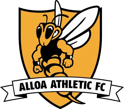
Alloa Athletic
There is, of course, a beloved third category: the wonderfully insane. These badges don't have much in common with each other, despite being slightly batshit.
Alloa Athletic

"What symbol best represents our beloved football club?"
"A grimacing, jacked up wasp?""FUCKING BRILLIANT"
Esbjerg FC

Quite obviously designed at some point over 40 years ago and left untouched for posterity. Endearingly naff.
Burton Albion


Quite obviously designed at some point over 40 years ago and left untouched for posterity. Endearingly naff.
Burton Albion
A portly gentleman kicking a football gets my endorsement every day of the week. If anybody from Burton is reading, I'm available for competitively priced modelling.
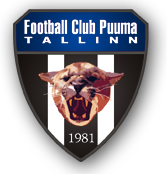
FC Puuma Tallinn
Who needs symbolism? Whack a PNG file of a puma onto your crest and call it a day.
Prachuap FC
ANOTHER grimacing, jacked-up wasp? Maybe this is more common than I suspected...
No comments:
Post a Comment